Author: Michael Howell Compiler: Block unicorn
Asset allocation is often done in a vacuum, with little regard for the monetary policy that investors will face. The standard approach is to build a portfolio with a 60:40 split between stocks (risky assets) and high-quality bonds (safe assets). The rationale is that these two asset classes are negatively correlated at many times, especially during recessions.
While this thinking forms the cornerstone of modern wealth management, it is in practice only applicable at specific times and in special circumstances. These time periods lasted from the early 1980s to the global financial crisis (GFC) of 2008/09. This approach did not apply in the 1970s, and arguably does not apply today.
The key to understanding wealth management and asset valuation is inflation. In short, while we all obviously want to get richer, our primary focus is at least on maintaining real wealth levels. Assets should not be compared to each other (such as bonds vs. stocks), but to inflation.
Inflation can be a difficult concept to measure, but for ease of illustration, assume that it represents the loss of purchasing power of paper money. Inflation can arise from both monetary inflation, i.e. "printing money", and cost inflation, such as rising oil prices and falling productivity.
The following chart shows how inflation affects the valuations of different asset classes. The chart is schematic, but can be constructed empirically using long-term data published by academic Robert Shiller on his website. We show our version below using data since 1880. The curves are fit using polynomial regression.
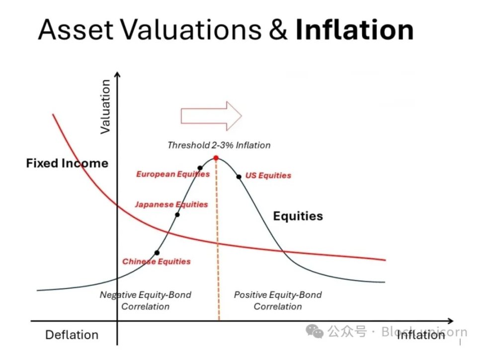
High-quality bonds, such as U.S. Treasuries, exhibit a monotonic relationship: as inflation accelerates, their valuations fall (yields rise); as deflation approaches, their valuations rise (yields fall). Textbooks also recognize this trade-off. Real assets (not shown in the figure), such as residential real estate, land, gold, and perhaps Bitcoin, follow the exact opposite path. As inflation accelerates, their valuations and prices rise.
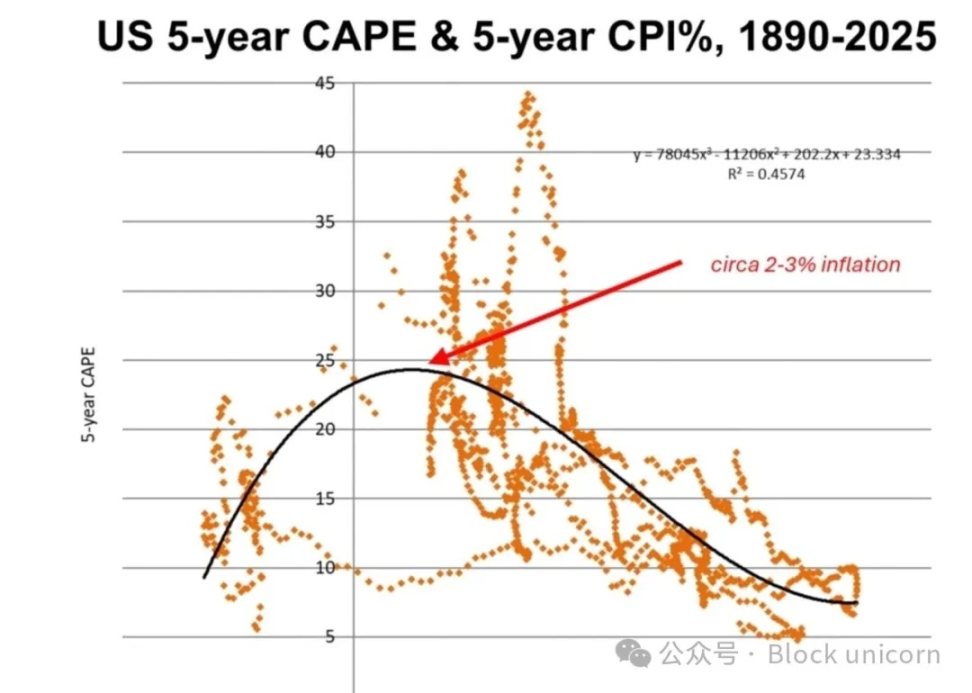
In contrast, the relationship between stocks and inflation is more complex and nonlinear. This is not taught in finance textbooks. On either side of the 2-3% inflation “sweet spot” (where P/E valuations peak), both rising and falling inflation rates lead to lower valuations. In other words, on the left side of this valuation peak, stocks and bonds are negatively correlated (the “risk parity” zone), and on the right side they are positively correlated. The change in the correlation pattern requires major adjustments in portfolio construction.
Most of our investment experience since the 1980s has been in the “low” inflation zone, around and mostly to the left of this valuation peak. Not only does this strongly support a large allocation to stocks, but even small changes in inflation rates justify holding bonds, as they are negatively correlated with stocks. [Note the divergence in the stock and bond valuation lines.] This is particularly true when the economy is weak or even testing deflation. Japan is a historical example of what happens to stock and bond valuations in "very low" inflation territory.
But this was not characteristic of the inflationary period of the 1970s. Back then, real assets were in high demand while financial assets severely underperformed. The same chart shows why. To the right of the valuation peak, around 2-3% inflation and above, both stock and bond valuations declined. Moreover, their declines were synchronized. This correlation weakens the case for holding both assets in a portfolio. In fact, the inverse and positive performance of real assets with inflation strengthens the case for their inclusion in a portfolio.
Rising Monetary Inflation
Our recent research has focused on the buildup of monetary inflation risk, i.e., the deliberate devaluation of paper money by governments. [We are neutral on cost inflation.] ] The chart includes a right-pointing arrow as a reminder. In other words, the 60:40 asset allocation (or "risk parity" approach) is under serious threat. Looking ahead, what investors should be thinking about now is: reduce bond holdings and increase real assets.
Admittedly, the chart we have drawn shows that the right tail of the bell curve for stock valuations is below the bond valuation line. Of course, this is not always the case. Unlike bond coupons, stock returns and dividends may rise with inflation. The valuation trend of different stocks will be different because some stocks are more effective hedges against inflation than others, so their valuations may remain at relatively high levels. On the other hand, many companies will find it difficult to maintain profitability in a high inflation environment. However, we are discussing the general situation here, not the specific details.
Global bond yields are gradually rising. This is driven more by an increase in term premiums than by higher policy rates. This suggests that the rise in yields may be caused by a combination of rising inflation uncertainty and concerns that high government spending will lead to a greater supply of coupon securities.
Looking at the market, we believe the US currently faces greater inflation uncertainty, both because of its large fiscal deficit and the expected increase in "business taxes" due to the imposition of tariffs. More importantly, the fiscal deficit is increasingly financed by short-term securities, which increases the risk of monetary inflation.
Japan has recently experienced an uptick in inflation, mainly due to rising wage costs, but this was after decades of deflation with intermittent deflation. In other words, placing Japan in the above chart, its equity valuations could rise to the "sweet spot" of 2-3% inflation. Obviously, at current low levels, the 1.5% Japanese Government Bond (JGB) yield does not actually look attractive.
China is currently in a deflationary phase after the "tariff shock", possibly at an earlier stage than Japan. Chinese stock valuations are low, but further monetary stimulus and a firmer economy could easily shift investor sentiment back to stocks.
Meanwhile, European equities are close to the ideal “sweet spot” by inflation standards, but they are somewhere between U.S. and Asian markets. In other words, if inflation continues to rise (and we believe the world is headed for stagflation), then European stock valuations are more likely to follow the U.S. and be adjusted downwards.
Asset Allocation Conclusion
The 60:40 or “risk parity” model favored by wealth managers for decades faces severe challenges in a monetary inflation environment. We would prefer to reduce bond allocations, or at least shift some of them to index-linked bonds (TIPS).
The asset mix should be tailored to the investor, but using the 60:40 benchmark for financial assets as an example, we would prefer to strategically adjust the asset mix to 60:10:10:10:10 . Here, 10% might be allocated to TIPS; 10% in cash; 10% in gold and precious metals, and 10% in Bitcoin. We exclude specialized physical assets like prime residential real estate and land, not because they are unattractive, but because they are less liquid and are generally permanent, non-tradable components of an investor's wealth.
A mild rise in inflation could be bullish for stocks overall. We plot the nominal holdings of different markets in the chart above. Wall Street is arguably "past its peak" due to the inflationary problems in the U.S. economy. European inflation remains muted, while China and Japan are emerging from a deflationary/low inflation environment that favors bonds over stocks. It may be worth investing in these Asian markets, but be wary of their greater geopolitical risk.


 Anais
Anais

