Source: CryptoVizArt, Glassnode; Compiled by: Deng Tong, Golden Finance
Abstract
In this article, we introduce a new risk assessment framework that leverages a core set of on-chain tools covering both short- and long-term risk cycles.
With this new framework, we aim to provide investors and analysts alike with a powerful model to assess drawdown risk from a data-driven perspective.
In summary, we compile all considered indicators into heat maps to assess the risk fusion across various data categories.
Macro Risk Analysis
Analysts can use a number of models and indicators to assess market risk at any given point in the cycle. In this article,in this article, we will specifically consider the “risk” of a significant decline in the spot price of Bitcoin.
Therefore, "High risk (red)" is Defined as the point at which a market may fall into a speculative bubble. In contrast, the "Low Risk (Green)" environment is considered to be mostly speculative excess The environment has been cleared and the market is more likely to be in a bottom forming pattern.
Price Bubbles
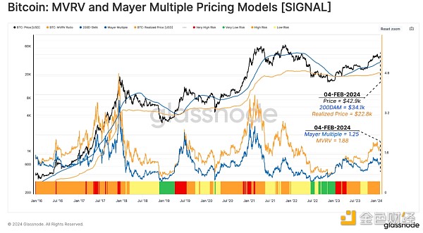
As a first building block, we monitor price deviations from two long-term mean reversion baselines:
< span style="color: rgb(255, 0, 0);">MVRV model (red):This model measures the ratio between the spot price and the market's overall cost base (realized price) .
Mayer Multiple (blue): Using 200D-SMA as a technical cycle The midline measures the premium or discount relative to this baseline.
In the figure below, we define the following risk categories using a combination of MVRV and Mayer Multiple (MM) models.
Risk analysis framework
Extremely high risk (red)
Prices are higher than both models (MVRV > 1 and MM >1), and the Mayer multiple trades two standard deviations above its cumulative mean (MM > +2 STD) .
High risk (orange)
Price is above the model (MVRV > 1 and MM >1), and the Mayer multiple is two standard deviations below its cumulative mean (1.0 < MM < +2 STD).
Low risk (yellow)
High price At the realized price (MVRV>1), but below the 200-day moving average (MM<1).
Extremely low risk (green)
Price Below the realized price (MVRV<1) and the 200D-MA level (MM<1).
The current spot price is $42,900, and the realized price and 200-day moving average are trading at $22,800 and $34,100. This puts the market in a high-risk environment.

Measure supply profitability
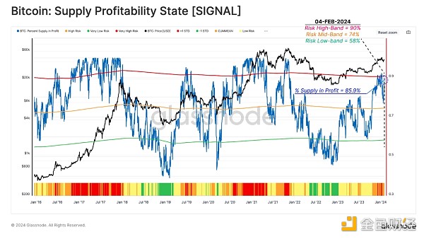
Supply Percentage of Profit (PSIP) (blue)The metric measures the proportion of tokens with a cost basis below the current spot price. This indicator can help identify potential risks of increasing selling pressure as investors see increasing motivation to take profits.
Risk analysis framework
Extremely high risk (red)
PSIP is more than one standard deviation away from its historical average.
(PSIP > 90%)
High risk (orange)
span>
PSIP is less than one standard deviation above the historical average.
(75% < PSIP < 90%)
Low risk (yellow )
PSIP is below the historical average but above the statistical lower limit.
(58% < PSIP < 75%)
Extremely low risk ( Green)
PSIP is more than one standard deviation below the historical average.
(PSIP < 58%)
When this indicator trades above its upper limit, it has historically been consistent with the market entering the "euphoric phase" of a bull market. During the recent market rally surrounding the launch of cash ETFs, this indicator reached Extreme Risk , before the price contracted to $38,000.

Measuring Fear and Greed
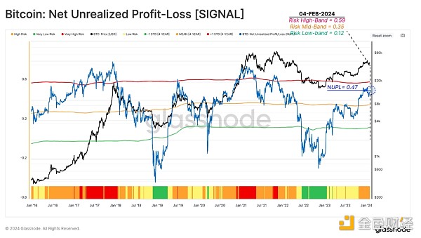
Another powerful tool for quantifying the risks associated with growing fear and greed sentiments in the market is the Net Unrealized Profit and Loss (NUPL) metric. This metric checks the dollar value of total net profit or loss as a percentage of market capitalization.
So, after estimating the profit number using the supply percentage of profits, we can use NUPL to measure the size of investor profits.
Risk analysis framework
Extremely high risk (red)
NUPL is one standard deviation above the 4-year average, indicating that the market is in a euphoric phase with unrealized profits reaching extreme levels (NUPL > 0.59).
High risk (orange)
NUPL Located between the upper limit and the 4-year average, indicating that the market is in a net profit state, but below the statistically high level (0.35 < NUPL < 0.59).
Low risk (yellow)
NUPL has Below the 4-year average, but above the statistically low level (0.12 < NUPL < 0.35).
Very low risk (green)
NUPL It has broken below the statistical low band, which is historically consistent with the bottom-finding phase of a bear market (NUPL < 0.12).
Following the October 2023 rally, NUPL entered high-risk territory, reaching a value of 0.47. Although the number of tokens held by profits increased significantly, the size of the USD profits did not reach extremely high-risk status. This suggests that during the second half of 2023, a significant portion of the tokens were accumulated on a cost basis within the ~$30,000 consolidation range.

Realized Profit and Loss
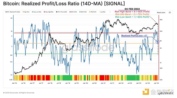
The next step is to assess how market participants are adjusting their spending patterns, and the Realized Profit and Loss Ratio (RPLR) is an excellent compass for doing this.
This indicator tracks the ratio between profitable and loss-making events that occur on the chain. We use the 14D-MA of this ratio to remove day-to-day noise and more clearly identify macro changes in investor behavior.
Risk analysis framework
Extremely high risk (red)
RPLR is higher than 9, which means that more than 90% of the coins moved on the chain are used for profit, which is a typical feature of market demand exhaustion (RPLR > 9).
High risk (orange)
RPLR Below 9 and above 3, it indicates that 75%-90% of the tokens are moved in profit. This structure often occurs around market peaks (3 < RPLR < 9).
Low risk (yellow)
RPLR has fell below the midline of 3, which typically occurs when the market goes through a transition between high-risk and low-risk states (1 < RPLR < 3).
Extremely low risk (green)
RPLR Trading below 1 indicates that the coin is dominating losses, which is a signal of investor capitulation and is common in the late stages of a bear market.
The indicator has recently flagged extremely high risk status as the price hit a recent peak of $48,400. The current realized profit-to-loss ratio is 4.1, which puts it in a high-risk position.

Activity risk analysis< /h2>
Changing gears a bit, we will now assess risk through the lens of demand and measure it using a range of adoption metrics related to network activity.
Demand for block space
Given the limited block space in the Bitcoin network, measuring demand An effective way to do this is by examining the fee market. Typically, continued growth in demand causes fees to continue to rise as competition for the next block intensifies.
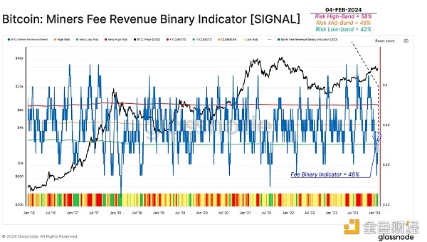
The Miner Fee Revenue Binary Indicator (MFR-BI) shows the proportion of days over the past 30 days that have seen increasing fee market pressure.
Risk analysis framework
Extremely high risk (red)
Last month, MFR-BI was heating up on more than 58% (+1 STD) of its days. This suggests an increasing urgency for investor spending (MFR-BI > 58%).
High risk (orange)
MFR-BI is between historical average and the statistical upper limit (48% < MFR-BI < 58%).
Low risk (yellow)
MFR-BI has fallen to historical averages below, indicating that competition in the fee market is waning (42% < MFR-BI < 48%).
Very low risk (green)
MFR -BI has fallen below the low statistical range of 42% (-1 STD), indicating a reduced urgency among investors to move capital (MFR-BI < 42%).

Speculative MomentumSpeculative Momentum h3>
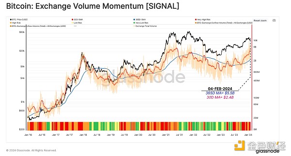
As the final component of our activity risk analysis suite, we revisit the Exchange Volume Momentum indicator, which compares average monthly and yearly volumes from/to all exchanges. This instrument can represent speculative interest in the market.
This risk indicator measures the magnitude and direction of changes in the faster monthly moving average (30D-MA) relative to the slower annual moving average (365-MA).
Risk analysis framework
Extremely high risk (red)
When the monthly moving average is higher than the annual moving average and continues to rise, the risk coefficient is considered to be very high (MA-365D < MA-30D and MA-30D).
High risk (orange)
Current month When the average trading price is above the annual average but is declining, the risk factor is marked as high (MA-365 < MA-30D and MA-30D).
Low risk (yellow)
Average of the month Risk factors are marked as low when values are below the annual average but increasing (MA-30D < MA-365D and MA-30D ).
Extremely low risk (green)
Current month When the average is below the annual average but is declining, the risk factor is marked as very low (MA-30D < MA-65D and MA-30D ).
The monthly average of exchange inflows has been trending strongly upward since October, placing this metric at extremely high risk. This indicates that the market is currently in a relatively speculative state.

Short-term and long-term risks Analysis
The above risk analysis considers a relatively macro and overall perspective. In the next section, we evaluate the pattern in more detail, considering the behavior of short-term and long-term holder groups.
New investors profit
Revisiting previous reports (WoC 38, 2023 and WoC 50, 2023 ) concluded that short-term holders tend to have outsized influence in shaping near-term price movements (such as local tops and bottoms).
We therefore use a causal approach to discover high (or low) risk intervals. This is based on a two-step assessment:
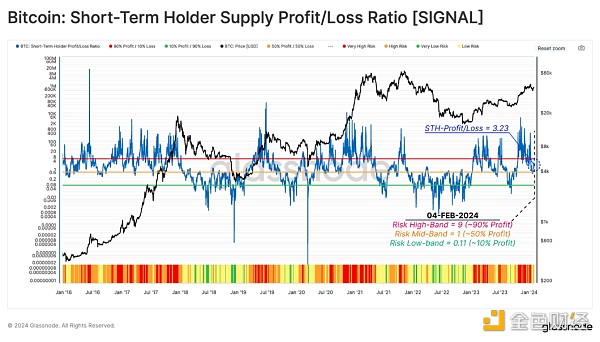
We start with the short-term holder supply profit-to-loss ratio (STH-SPLR), which reflects the balance between profits and losses on supply held by new investors.
Risk analysis framework
Extremely high risk (red)
STH-SPLR is greater than 9, indicating that 90% of new investor tokens are making profits, creating a strong incentive to spend (STH-SPLR > 9).
High risk (orange)
STH -SPLR is between 1 and 9, indicating that 50% to 90% of new investor tokens are profitable and the payout risk is moderate (1 < STH-SPLR < 9).
Low risk (yellow)
STH- SPLR is between 0.11 and 1, indicating that 10% to 50% of new investor supply is profitable, leaving the majority of their holdings underwater (0.11 < STH-SPLR <1).
Extremely low risk (green)
STH -SPLR fell below 0.11, indicating that more than 90% of the new investor supply is at a loss, which is a typical situation in the late stages of a bear market (STH-SPLR < 0.11).
With ETF speculation reaching its peak, the indicator recently pointed to mid-October 2023 to January 2024 Extremely high risk conditions exist between mid-month. This suggests that the vast majority of new investors have achieved profits, increasing the likelihood of profit-taking. The situation has since cooled to neutral-low risk territory.

Lock-in short-term gains
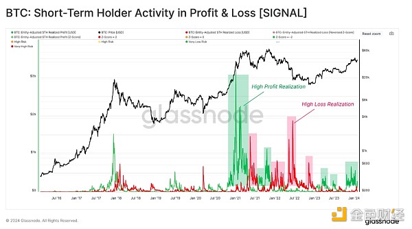
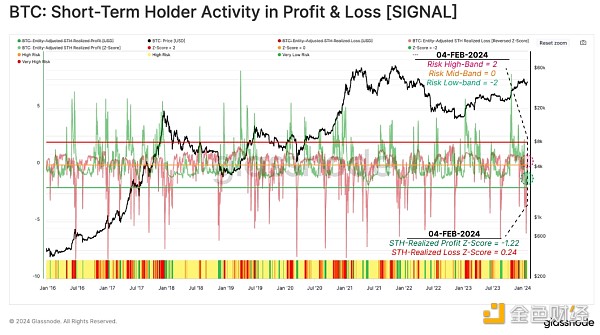
The next step is to focus on the actual payout of these short-term holders, as measured by their realized profits or losses. The chart below highlights an example of a high profit-taking (or loss) regime since January 2016. As the chart shows, these periods of high spending tend to coincide with strong rallies and corrections.

We use 90 days These indicators are transformed and normalized by the Z-score function, which normalizes the activity of short-term holders in U.S. dollars. The technique helps spot when short-term holder spending exceeds statistical extremes, which can translate into potential local tops and bottoms forming within the market.
Note that to improve the visualization of this risk metric, we inverted the realized loss z-score (multiplied by -1).
Risk analysis framework
Extremely high risk (red)
STH's profit Z-score is more than +2 standard deviations above the 90D mean, indicating significant profit-taking (STH realized profit Z-score > 2).
High risk (orange)
Profit STH in Z-Score is between the 90D mean and the +2 standard deviation level, indicating moderate profit-taking (1 < STH Realized Profits Z-Score < 2).
Low risk (yellow)
Profit Z A drop in STH in the score below the 90D average indicates a significant reduction in profit taking, often accompanied by an increase in realized losses. (STH-Realized Profit Z-Score < 1)
Extremely Low Risk (Green)
Similar to low risk, STH in the Profit Z score fell below the 90D mean, while at the same time realized losses increased to +2 standard deviations above the 90D mean (STH Realized Profit Z score < 1 and STH-realization loss Z-score > 2, note the reverse visual aspect).
According to this metric, the recent price adjustment to $38,000 following the launch of the ETF resulted in a significant reduction in market risk. The STH Realized Profit Z-Score is currently -1.22, while the STH Realized Profit Z-Score is -0.24. This puts the current market structure into a low-risk regime.

Veterans lock in profits< /h3>
We introduced a similar framework to the short-term holder risk assessment described above, but it focused on long-term holders (LTH) in a previous report (WoC-22-2023). The goal is to assess when unrealized profits held by long-term holders reach statistically extreme levels and then track whether this group increases spending accordingly.
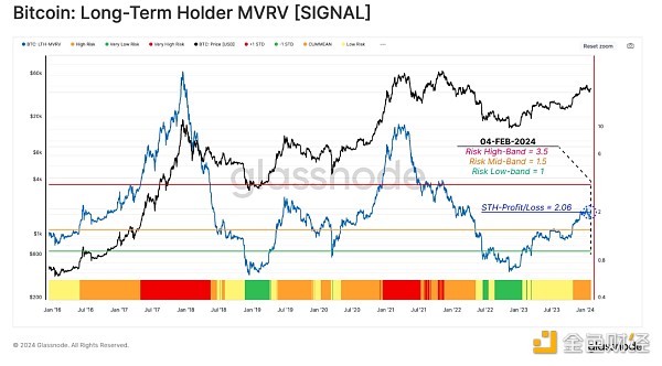
The first metric measures the unrealized profit portion of LTH using the Long Term Holder MVRV ratio. This measures the difference between the market price and the average LTH cost base.
Risk analysis framework
Extremely high risk (red)
LTH-MVRV is greater than 3.5, indicating that LTH's average unrealized profit is 250%. This range is typically reached when the market retraces its previous ATH (LTH-MVRV > 3.5).
High risk (orange)
LTH-MVRV is between 1.5 and 3.5 inter-trade. This situation usually occurs in the early stages of bear and bull markets (1.5 < LTH-MVRV <3.5).
Low risk (yellow)
LTH- MVRV trades between 1.0 and 1.5, indicating that LTH is only marginally profitable on average, typical of late bear markets and early bull markets (1 < LTH-MVRV <1.5).
Very low risk (green)
LTH -MVRV is trading below 1.0 as spot prices fall below the average LTH cost basis. This often highlights a state of seller fatigue and investor capitulation (LTH-MVRV < 1).
The indicator has risen to 2.06, entering high-risk territory after a challenging recovery following the FTX crash. As mentioned earlier, these levels typically appear in the early stages of a bull market as long-term investors recover to relatively meaningful levels of profitability.

Long-term holders Spending
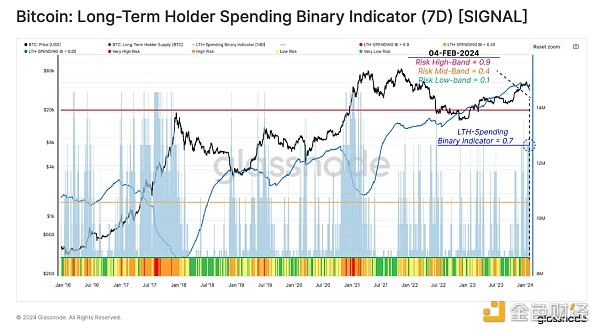
In the final step of this risk analysis study, we construct a binary indicator to evaluate when LTH spending continues to grow. The Long-Term Holders Send Binary Indicator (LTH-SBI) tracks the period during which LTH spending is sufficient to reduce the total LTH supply for a duration of 7 days.
When LTH supply decreases, it indicates that long-dormant supply reenters the liquid circulation to offset new demand.
Risk analysis framework
Extremely high risk (red)
The LTH-SBI reached above 0.85, indicating that LTH has increased its spending on 6 of the past 7 days. This pattern is associated with veterans seizing opportunities to lock in profits at high prices (LTH-SBI > 0.85).
High risk (orange)
LTH -SBI is trading between 0.50 and 0.85, indicating a slight increase in LTH spending on at least 3.5 of the last 7 days (0.50 < LTH-SBI < 0.85).
Low risk (yellow)
LTH- SBI is trading between 0.14 and 0.50, indicating a relatively small degree of LTH spending that occurred last week (0.14 < LTH-SBI < 0.50).
Very low risk (green)
LTH -SBI fell below 0.14, indicating that LTH spending was minimal and its total supply was reduced by 1 day or less last week (LTH-SBI < 0.14).
ETF speculation rebounded to $48,400, pushing this risk gauge from low to high risk territory. The current value is 0.7, indicating an increase in LTH payouts as investors and ETFs rebalance (i.e. from GBTC) and transfer token ownership.

Conclusion
In this article, we develop a procedure for assessing downside risk in the Bitcoin market. These risk factors consider a broad range of data and investor behavior categories and help establish a framework for analysts and investors.
While each indicator can be used on its own, combinations often provide a more complete picture of market conditions. The image below summarizes these into a heat map view of various risk indicators over the past 5 years. From this, we can compare the indicator with noteworthy tops and bottoms, and we can see significant confluences.
These levels and transitions are intended as initial guidelines and should be iterated by analysts and practitioners to optimize for specific points of interest.
 JinseFinance

